
60/40 Callout Card Banner Block - no formatting capabilities
Allows following:
- Image
- Video with heading and caption text
- Chip Header with option to make heading full width
- Can also swap layout to the left
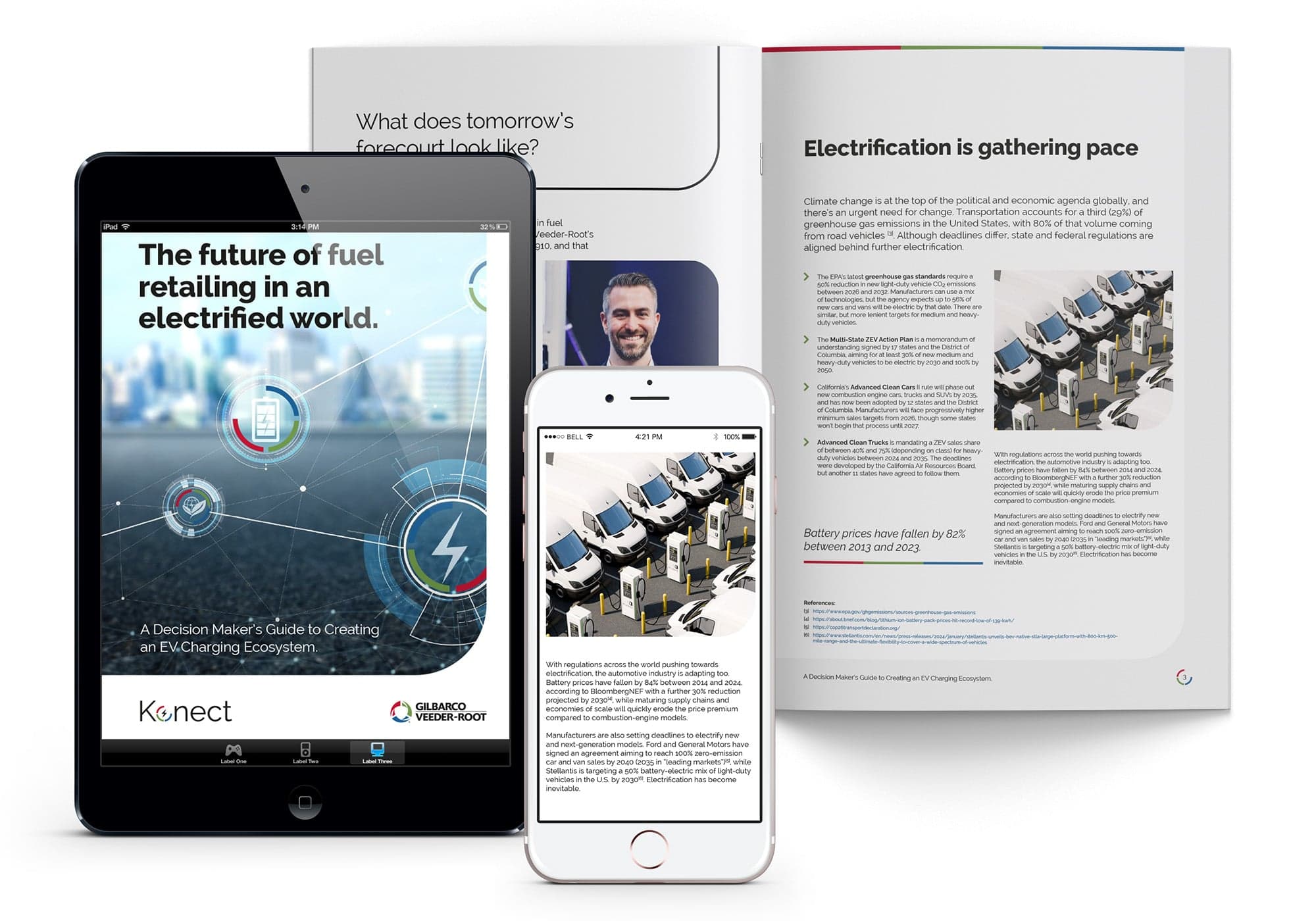
Eyebrow Heading - no text customizations
Free Text (WYSIWYG) Heading - no formatting capabilities
Full text formatting allowed including coding options and images. Background theme selection options.
Background Theme Options:
Get A Quote Hero Block Heading - no formatting capabilities

Hero Icon Block - Max 4 - SVG

Hero Icon Block - Max 4 - SVG

Hero Icon Block - Max 4 - SVG

Hero Icon Block - Max 4 - SVG
Eyebrown header - No text formatting
Horizontal Callout Card Banner Block Heading - No text formatting
Main Body Copy
- Text formatting available
- Photo and code options
- Module allows background pattern:

- Module allows background theme:

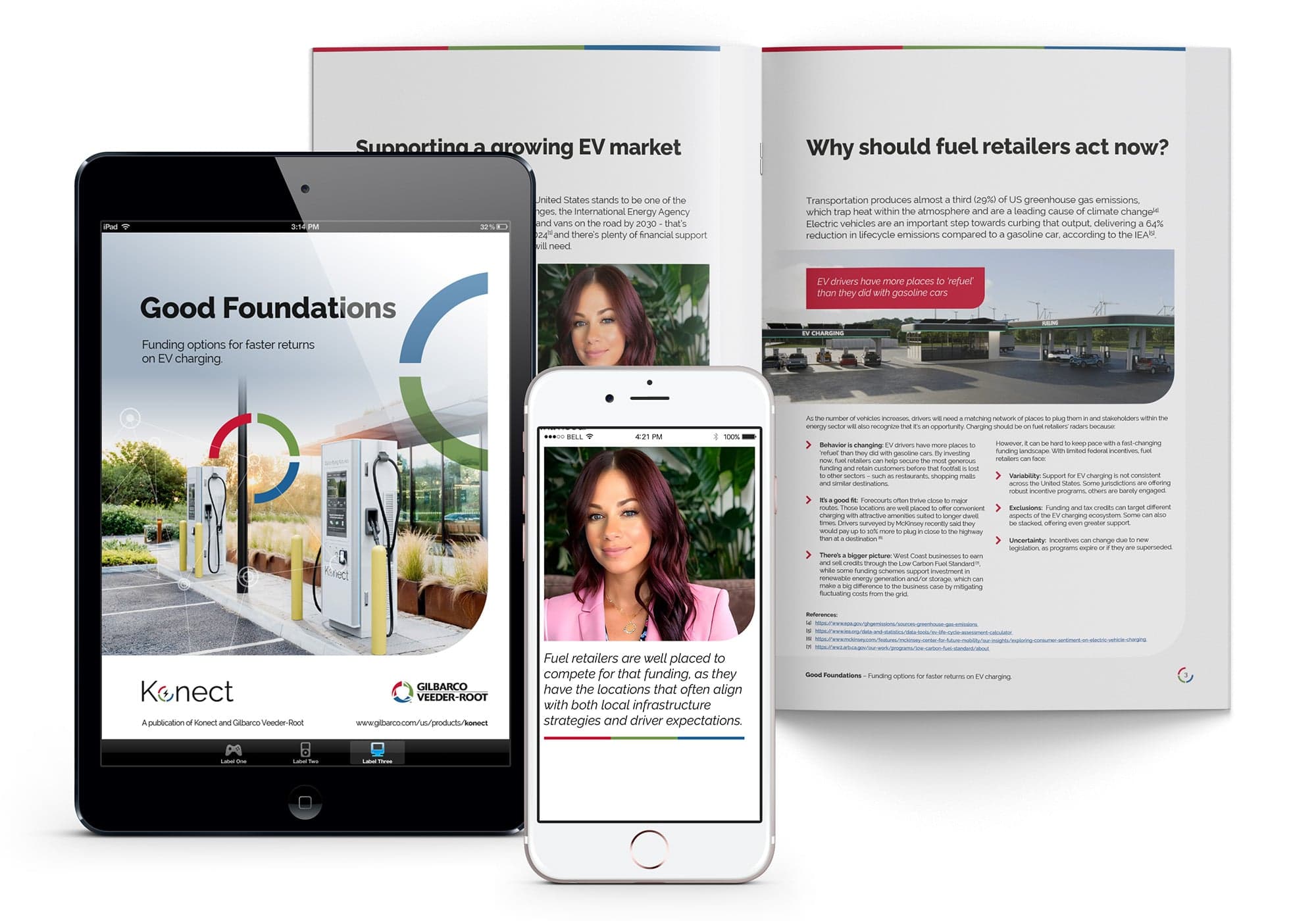
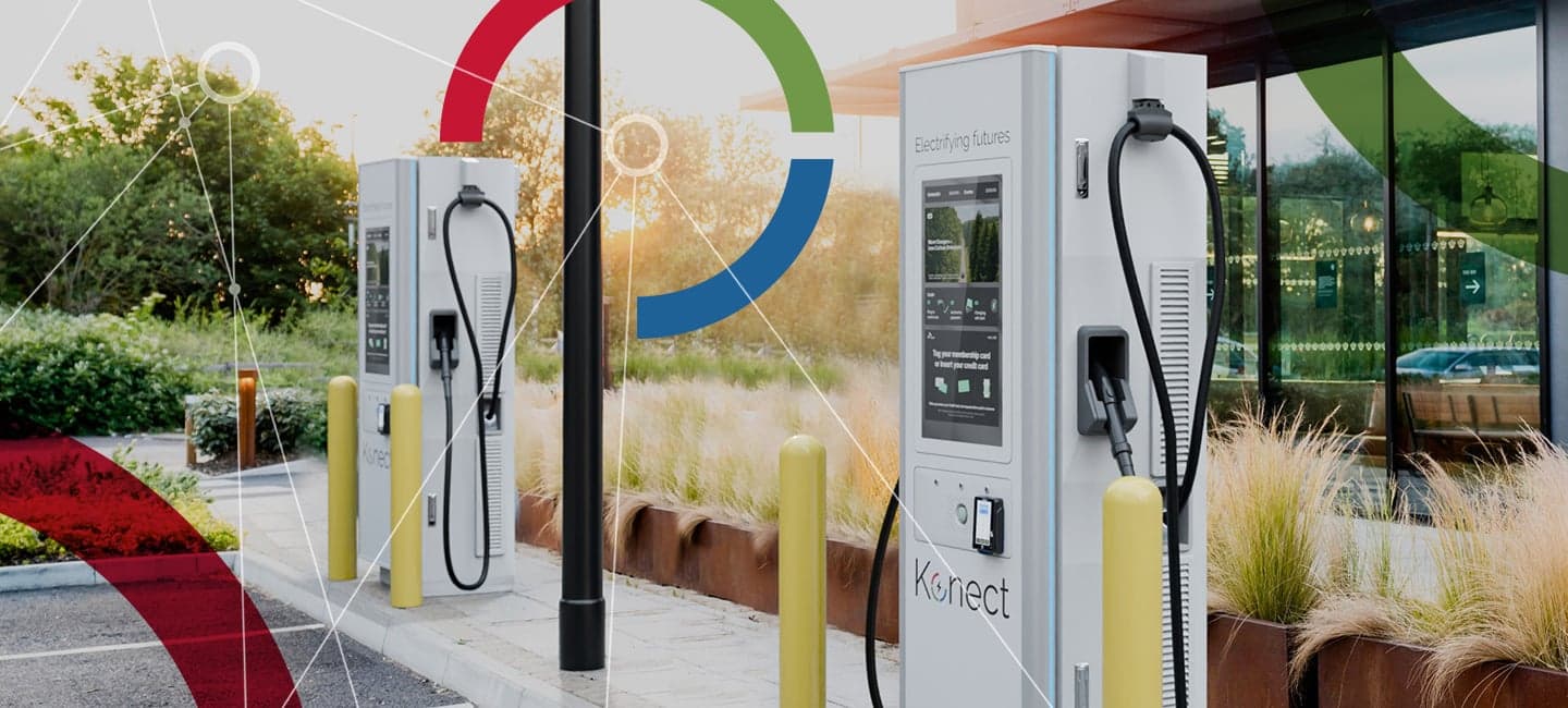
Card item heading - No text formatting
Short description - No text formatting - Min 1, max 3 Background themes available: white, light grey, dark green, navy
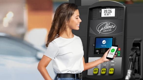
Card item heading - No text formatting
Short description - No text formatting
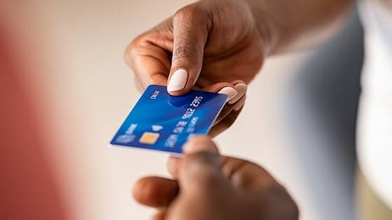
Card item heading - No text formatting
Short description - No text formatting
Horizontal Icon Cards Block - no formatting capabilities
Subheading allows short description with no formatting

Card Item Header 1 - no formatting capabilities -
Card Description: No formatting capabilities Min 1, max 6 Three cards per row with no ability to change Icons only, no images Background color options: white, light grey, dark green, navy, navy gradient, navy/green gradient CTAs allowed for each
Card Item Header 2
Same specs

Card Item Header 3
Same specs

Card Item Header 4
Same specs

Card Item Header 5
Same specs
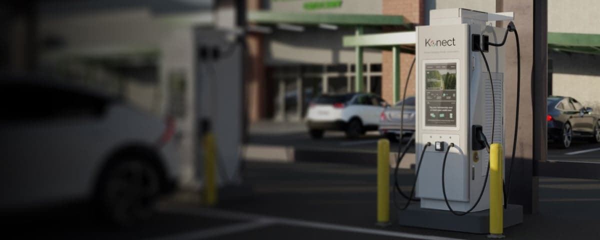
Horizontal CTA Block Heading - No text formatting
Main Body Copy
- Text formatting available
- Photo and code options
- Module allows background pattern:
- Module allows background theme:
Horizontal Icon Cards Block Heading - no text formatting
Subheading - no text formatting

Card Item Heading - no text formatting
Short description - no text formatting Icon/SVG only Min 1 card, max 6 (two rows)' Background theme: Current - white
Primary CTA





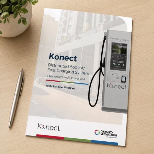
Image and Accordion Items Block Heading - no text formatting
Eyebrow Header- No text formatting
Image and Text Callout Block Heading - No text formatting
Main body - text formatting available
Switching layout available
Image Block Heading - No text formatting except for centering heading

Eyebrow heading - No text formatting
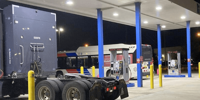
Image Hotspot Block Heading - No text formatting

Key Features Section Title - No text formatting
Key Features Item Heading - No text formatting
Key Features Item Subheading - No text formatting
Key Features Item Heading - No text formatting
Key Features Item Subheading - No text formatting
Key Features Item Heading - No text formatting
Key Features Item Subheading - No text formatting
Key Features Item Heading - No text formatting
Key Features Item Subheading - No text formatting
Quote Carousel Block 1 curly brackets around text for special styling Max 4

Quote Carousel Block 2 curly brackets around text for special styling

Quote Carousel Block 3 curly brackets around text for special styling

Quote Carousel Block 3 curly brackets around text for special styling